Data engagement is a fresh look at traditional ServiceNow enterprise reporting. It meets the diverse needs and various formats required by the modern enterprise – and with VividCharts, it helps deliver real-time project data to every critical stakeholder in every area of your organization.
It’s a horizontal concept that can be applied to any process on the ServiceNow platform. VividCharts has been used to vastly improve the reporting visualizations for many use cases, including the Project Management Office, the Service Management Office, and Managed Service Providers.
Let’s take a look at some of the common use cases we see for each.
Data Engagement for the Project Management Office
There are countless data engagement use cases for the PMO, but two of the most common are automated project status reporting and the PMO Overview dashboard.
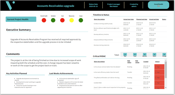
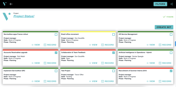
Automated Project Status Reporting
The VividCharts Data Engagement Platform can be configured to meet a wide variety of status reporting requirements. But every end-solution essentially boils down to three key areas:
- Precisely presenting the right data, visuals, and aesthetics
- Easy access for all key stakeholders
- Interactive pages that allow the use of status reports in various settings
Presenting the right data, visuals, and aesthetics
The VividCharts Data Engagement Platform offers multiple out-of-the-box status report options that can be configured and styled to your needs. Either pick your preferred layout, make a few small adjustments, or draw inspiration from our templates to create your own.
Easy access for stakeholders
The VividCharts Data Engagement Platform provides sharing controls that allow both fulfuller and non-fulfiller users in your ServiceNow environment to view status reports. Automated emails can be set up to deliver status reports to stakeholders on a defined schedule. PPT & PDF exports are just a click away. (see real examples in the VividHub)
Interactive pages that allow use of status reports in various settings
Status reports are used in various settings. The VividCharts Data Engagement Platform provides pages that power many more use cases beyond a single status report.
Steering Committee Meeting coming up? Filter down to your red projects and bundle them together in a simple, single slide deck.
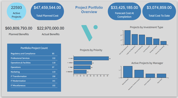
PMO Overview Dashboard
The PMO Overview dashboard template provides self-service access to key data points for in-flight projects. At a glance you will see important financial information, and projects broken down by portfolio, priority, investment type, and project manager.
With dynamic filters, you can empower end users to get to a more specific view in seconds.
Want to see slightly different metrics for your PMO? Just copy the template and adjust for your needs.
Data Engagement for the Service Management Office
Data engagement helps you get your data into specific presentation formats beyond a typical dashboard. The Service Desk Monitor and the Incident Review Slide Deck are perfect examples.
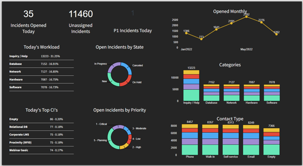
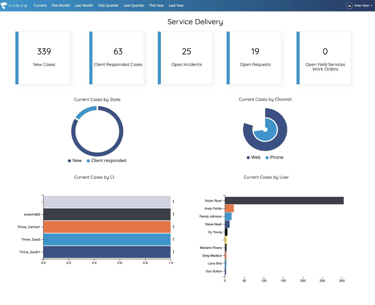
Service Desk Monitor
The Service Desk is all about fast action. Having wall monitors displaying real-time metrics, and self-service dashboards available for quick analysis can have a significant impact on key performance metrics.
The Service Desk Monitor template can get you both in a hurry. This template offers pre-configured charts that display best practice metrics. The layout and conditional styling is designed to enable quick consumption of information to drive quick action. You can make it available both on a wall monitor in the Service Desk office space, and via self-service for remote stakeholders to view in real-time.
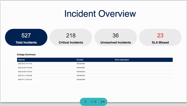
Incident Review Slide Deck
While dashboards serve a critical role, how often do you find yourself taking screenshots of charts and metrics just to prepare for a presentation?
Data engagement is all about taking the power of real-time reporting, and applying it to all of the settings where your organization leverages data.
With multiple slides and the ability to add text, you can tell a story about what is taking place combining charts that allow drill-down directly to the underlying data—with powerful insights from the field.
Need to combine your slides with a larger deck? That’s easy to do. Because you can export the whole deck to PPT with a click.
Data Engagement for Managed Service Providers
MSPs leverage ServiceNow for their external customers, so their most powerful data engagement use cases are customer facing. The two most common are self-service dashboards made available directly in the customer facing portal, and automated Quarterly Business Reviews.
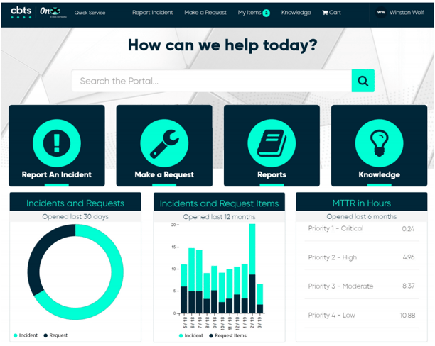
Self-Service Dashboards in the Customer Facing Portal
Presenting real-time data in a format that matches your overall customer portal aesthetic does not have to be a pain. The VividCharts Data Engagement Platform allows you to quickly build the views your customers care about, style them to match your overall portal aesthetic, and embed them in your ServiceNow portal for customers to interact with on their own.
The examples below show both individual charts and full dashboards styled and embedded seamlessly into customer portal experiences powered by ServiceNow.
Automated Quarterly Business Reviews
QBRs are a standard value-add that customers expect from their Managed Service Provider. Because of the time and manual effort it takes to consolidate the data into a presentable format for each customer, MSPs are faced with a difficult choice.
Either invest a significant amount of labor into producing a QBR for every individual client, or choose to only deliver QBRs to a subset of customers. Now you can reduce the amount of resources each requires.
With the VividCharts Data Engagement Platform, once you have your QBR template created, it will automatically deliver unique QBRs to as many clients as you want—on whatever schedule you want (quarterly, monthly, weekly, etc.).
.gif?width=600&name=Incident%20Overview%20(2).gif)
Start Your Data Engagement Journey Today
The time is right to ensure accurate, actionable, agile, and data-driven decisions for positive business outcomes in your organization. Here are some ways you can get more engaged with your data today:
- Review live, real-world examples on VividHub
- Book a 10-minute VividCharts Demo with a ServiceNow Specialist
- Find out why VividCharts is an Elite Technology Partner of ServiceNow